Branding
I love to tighten up a visual story whether it’s a new logo, logo refresh, brand guide, color palette, or supporting graphics. Here are a few times when I set the rules to ensure that the representation of each brand reflects it’s stated mission and values consistently.
RECORDING INCLUSIVITY INITIATIVE
I developed a scalable logo with multiple lockups for this vital new program focused on diversifying America’s playlist. Pairing black and white with a rainbow gradient to reflect inclusivity, the logo is set in Poppins, a substantially chunky yet friendly typeface. I had fun extending this visual language for print materials, social banners, and the website.

ALL CLASSICAL PORTLAND
To modernize and amplify this brand, I expanded the brand guide into a robust handbook for designers and volunteers alike. Clean, uncluttered, and focused design underscores the clear signal and thoughtful curation of this free resource. With careful editing, a buoyant new color palette, and small logo tweaks, I’m guiding the brand and it’s website with us into this century where everyone can access this music no matter what platform they choose. Long live the radio!


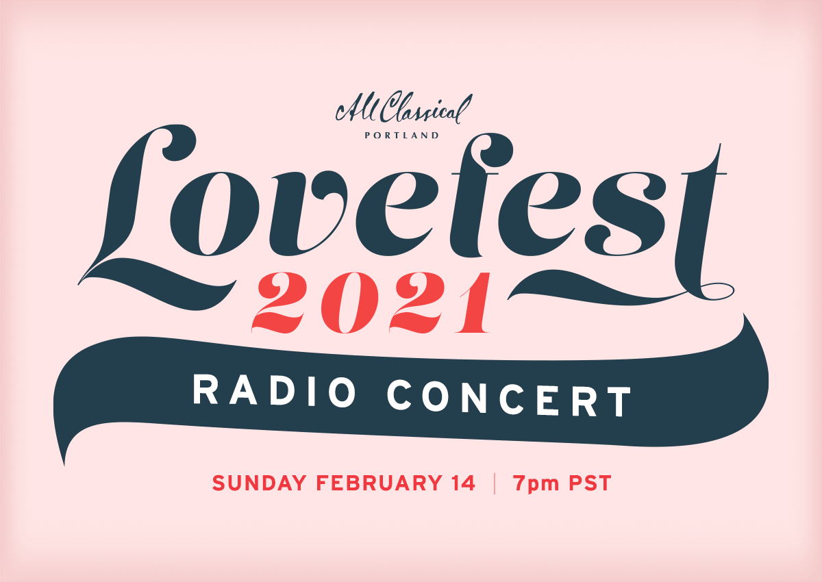
LOVEFEST CONCERT
The Lovefest Concert is a big THANK YOU to All Classical Portland listeners that has swiftly become a yearly tradition near Valentine’s Day. To reflect the ‘warm, playful, and romantic’ feel of the experience, I customized a typeface called LUST (!) for the logo and built all the marketing materials to frame and accentuate that vibe. I made posters, programs, and web marketing materials for 2020 (in fact, the last event I went to pre-COVID). For 2021, the event streamed online and I updated the whole lockup.


EMBRACE OREGON + EVERY CHILD
AGENCY: EROI
Embrace Oregon, a nonprofit that connects foster parents with foster kids, needed a logo and brand identity that could live in visual harmony with their main initiative, Every Child. Once these logos were established, I worked with a team to create a comprehensive brand guide for Every Child that provided the strategy and structure to power their expansion all over Oregon. In 2020, they jettisoned the name Embrace Oregon to become Every Child PDX. I’m proud that our guides helped them reach their goals for meaningful change.


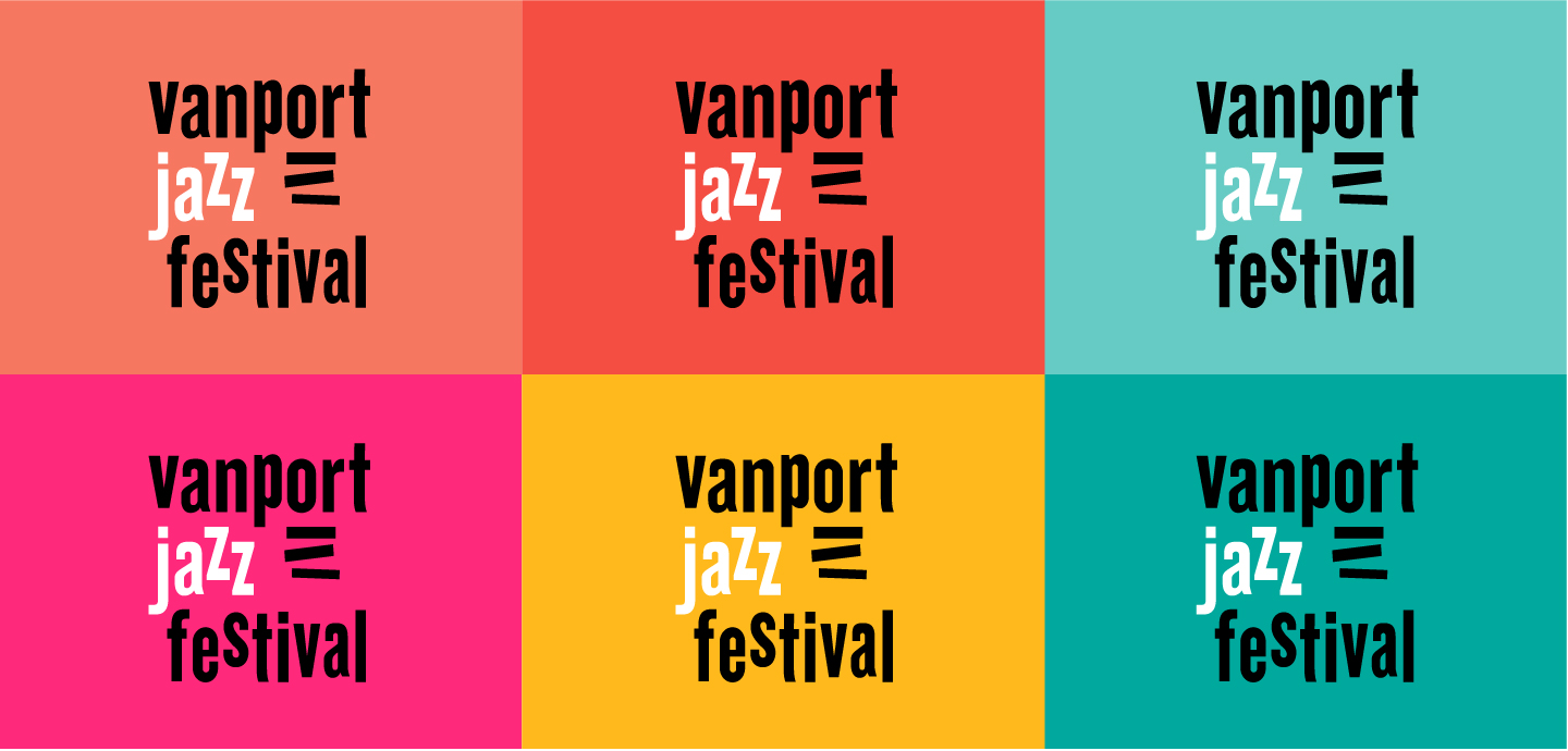
VANPORT JAZZ FESTIVAL
AGENCY: EROI
I designed the logo, branding, and website for this local festival experience in 2017. The brief called for a holiday-in-the-Bahamas vibe that celebrated Portland’s Jazz scene while acknowledging its rocky foundation in the flooded city of Vanport. I drew inspiration from the legendary Blue Note label graphics contemporary with that flood (1948). I paired beachy colors, dynamic letterforms, and 3 abstracted shapes that suggest a stack of records or piano keys that underscore the ‘OR’ in ‘Vanport’.